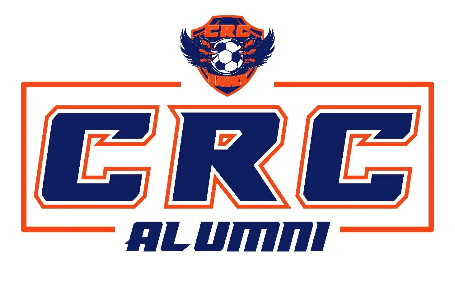
COSUMNES RIVER COLLEGE SOCCER Artwork
From 2020 onward, I worked closely with the head coach of Cosumnes River College Men’s and Women’s Soccer to help shape a more recognizable visual direction for the program. After moving away from an older logo treatment, we selected and licensed the Monster Truck typeface as the foundation for the updated look. From there, I developed recurring artwork several times each year for season launches, tournaments, championships, and special events. The goal was to keep CRC Soccer visually consistent while introducing subtle variations that made each design feel fresh and tailored to the moment.
Overview
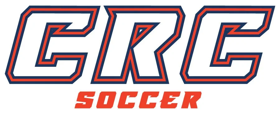
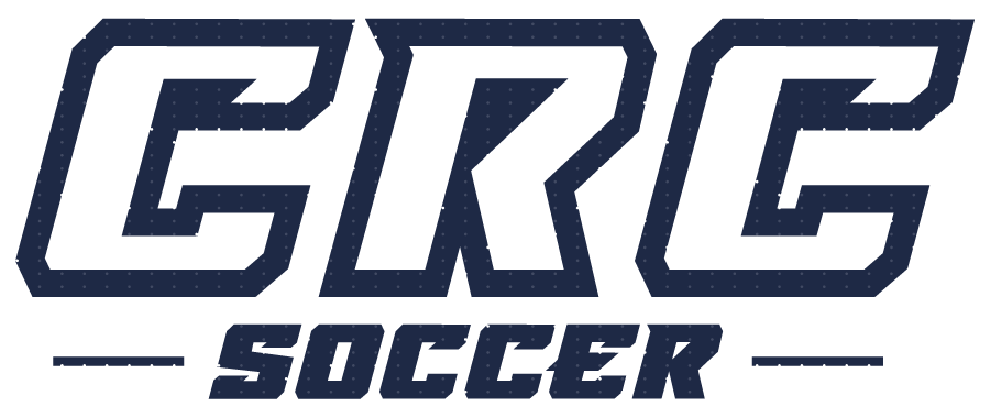
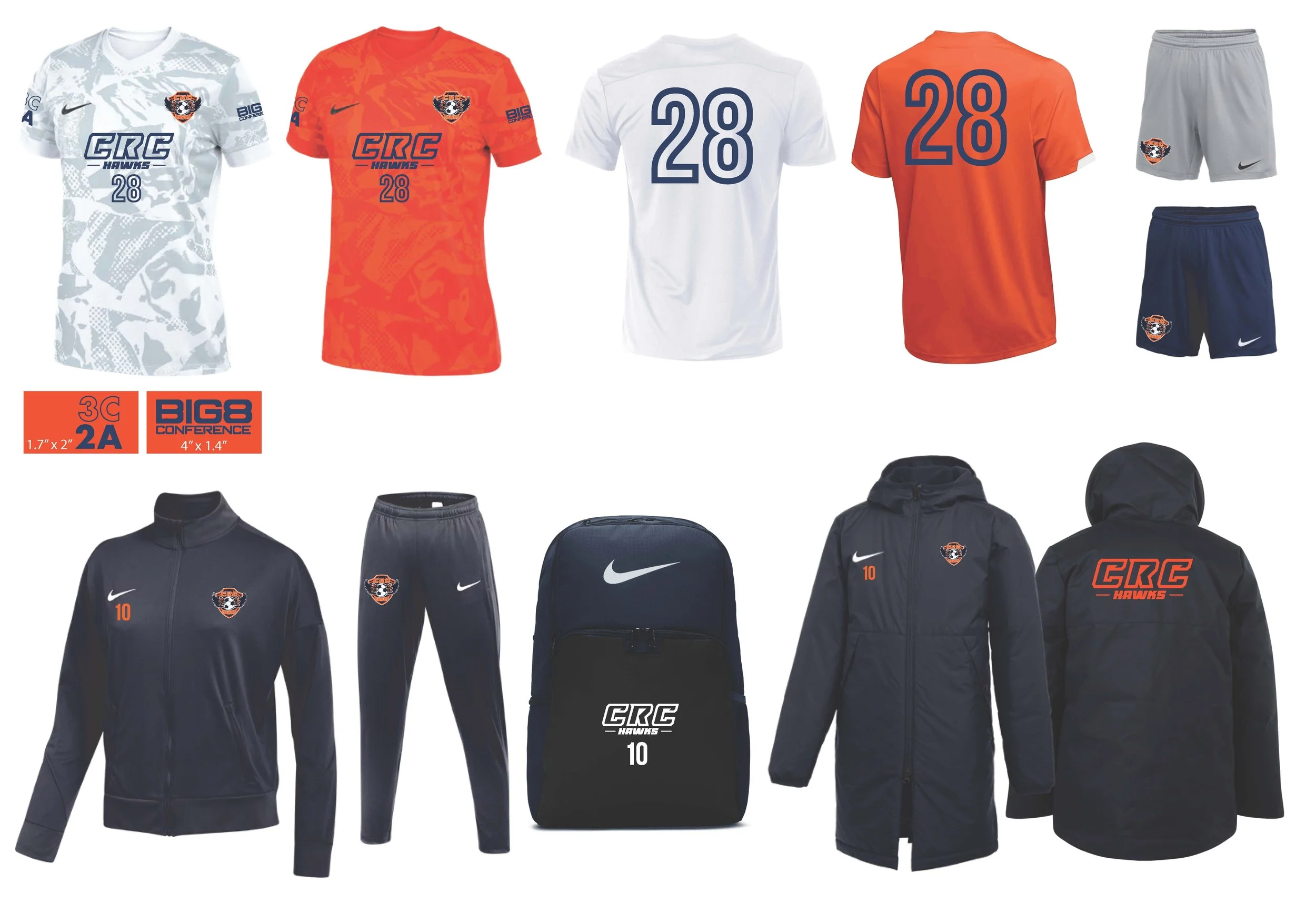
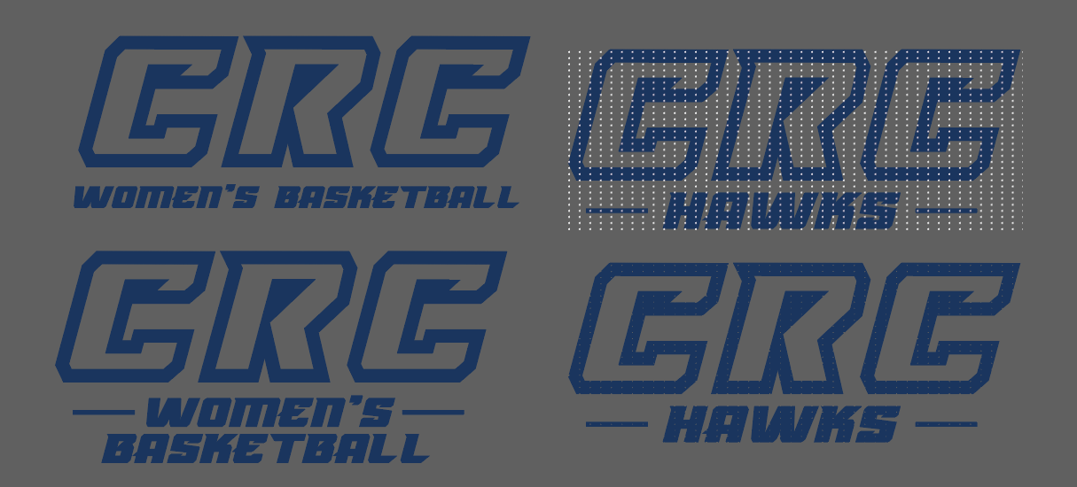
I created recurring apparel-focused artwork for Cosumnes River College Soccer across multiple years, primarily for jerseys, team gear, and special-event pieces. The system was built around bold “CRC” typography using Monster Truck, supported by the program’s navy blue, orange, and white color palette. Rather than reinventing the visual direction every time, the project focused on building a recognizable foundation that could evolve through slants, outlines, color shifts, textures, and supporting graphic details.
Over time, this became less about creating isolated designs and more about maintaining a repeatable athletic visual language for the program. I worked directly with the coach on each new piece, refining concepts until the artwork felt right for the team, the event, and the garment.
The Challenge
The core challenge was balancing consistency with variation. The coach wanted CRC Soccer to feel recognizable from year to year, but he also wanted each new release to feel different enough that players were getting something new rather than a repeat of the same design. That meant developing artwork with a strong shared foundation while still finding room for fresh visual adjustments each season.
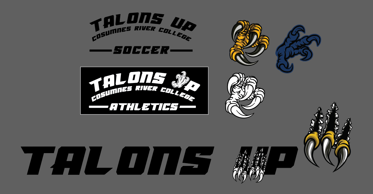
Another challenge was adapting the work across different uses and audiences. Early on, I created artwork for both the men’s and women’s programs, but as the focus shifted more heavily toward women’s soccer, scale and proportion became more important. Designs needed to have a bold athletic feel without being oversized or too heavy.
Production also played a major role in the design decisions. Because much of the work was intended for apparel, choices around width, outlines, spacing, and readability had to be considered from the beginning rather than treated as an afterthought.
Approach
Once the Monster Truck typeface was chosen, it became the anchor for the visual system. Most concepts began with the same basic “CRC” structure, and from there, I would refine the design through skew, slant, outlines, color blocking, and add elements such as boxes, lines, or spot textures to give each version its own character.
This approach allowed the artwork to stay connected to the program while still evolving. The consistency came from the typography, the color palette, and the overall athletic tone. The variation came from how those elements were arranged and pushed for each new release.
A major part of the project was the direct collaboration with the coach. Because we worked together repeatedly over multiple years, I developed a strong understanding of his preferences and could translate his feedback efficiently into visual directions that felt specific to CRC Soccer.
Design Process
Production Constraints
Typography was at the center of this project. Since the “CRC” letterforms became the most recognizable part of the visual identity, a lot of the design work came down to refining how that typography could shift from piece to piece without losing familiarity. I explored ways to create movement, weight, and energy by adjusting slant, proportion, outlines, spacing, and supporting details while keeping the base direction intact.
One of the strongest examples of that process came through a custom jersey number set created for a special event. We initially explored building the numbers from the Monster Truck style so they would align directly with the team’s established typography. After reviewing the forms, I realized the characters would become too wide for the jersey application, especially once outlines were added and the numbers needed to remain practical for cutting and production. To solve that, I shifted to a more condensed type direction and manually adjusted the forms so the final numbers still felt aligned with the overall visual system while working better in use.
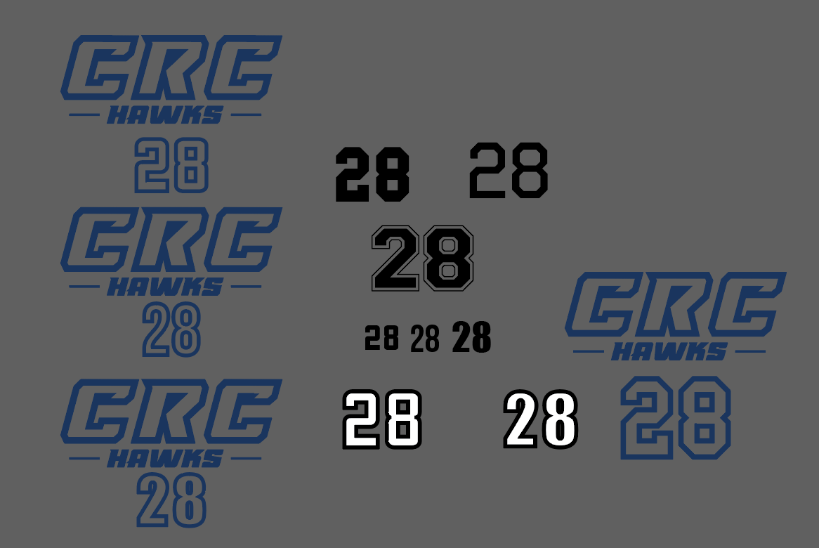
Because this work was created primarily for apparel, production requirements shaped the design from the start. The graphics had to reproduce cleanly, hold their legibility, and feel balanced on the final garments. Width, stroke weight, outlines, and spacing all had to be considered carefully so the artwork would not become too heavy, too wide, or too difficult to execute.
That was especially important in areas like jersey numbering, where a visually strong concept also had to remain functional. Rather than forcing a style into a format where it would not perform well, I adapted the direction to fit the production realities while preserving the overall look and feel of the CRC Soccer system.
Outcome
The result was a body of recurring artwork that gave Cosumnes River College Soccer a more recognizable and consistent visual presence over time. What started with a typeface decision evolved into a flexible athletic design system that could be reused and refined across multiple seasons, special events, and apparel needs.
This project reflects my ability to build recurring sports artwork around a strong typographic core, collaborate closely with a stakeholder over time, and create designs that feel fresh, cohesive, and production-ready. It also demonstrates a style of art direction rooted in refinement: taking a recognizable idea and evolving it in ways that keep it useful, engaging, and visually consistent from year to year.