John Knight Middle School Artwork
Recurring apparel and event artwork developed for John Knight Middle School, designed to stay recognizable, budget-conscious, and effective across a range of school and sports applications.
Overview
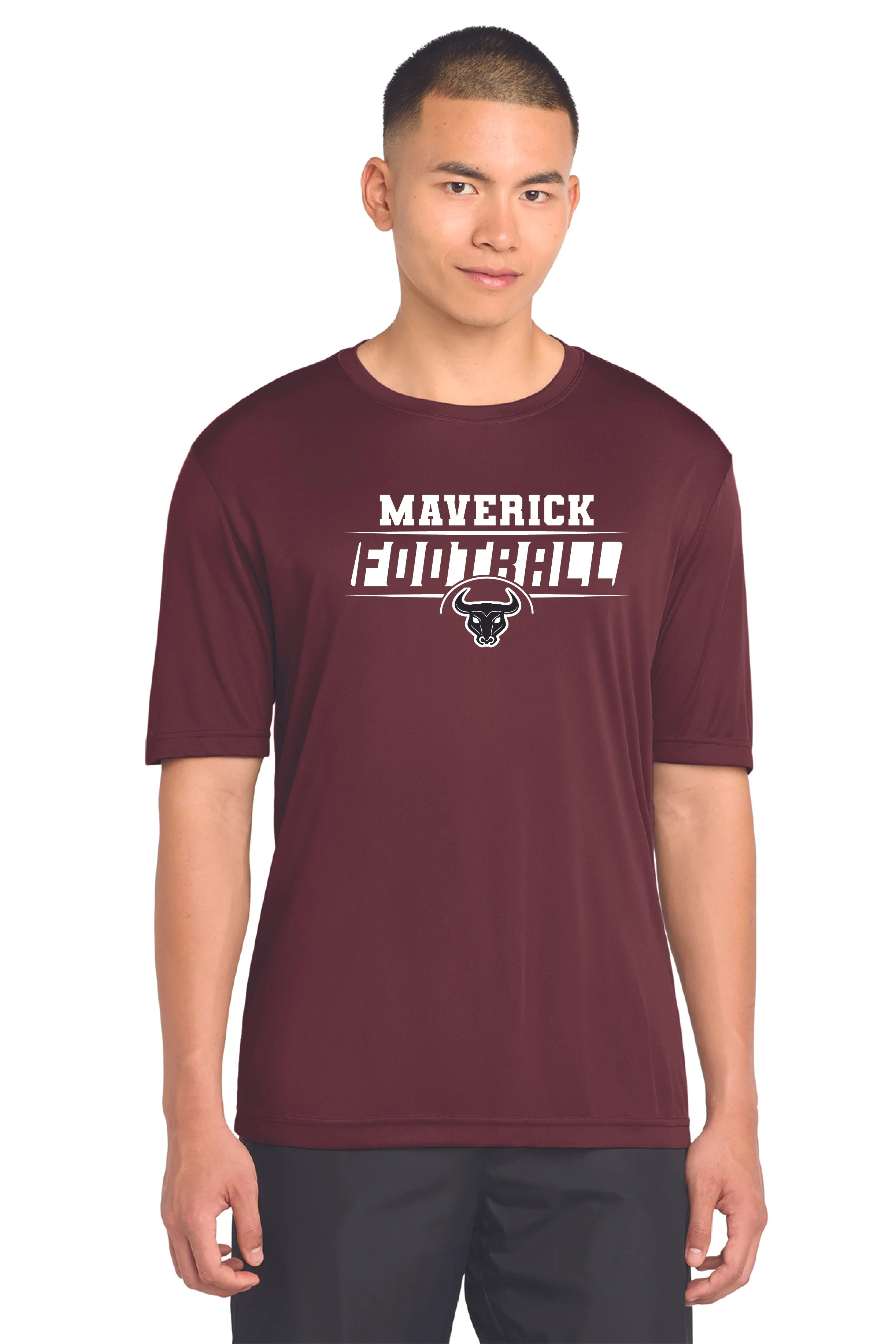
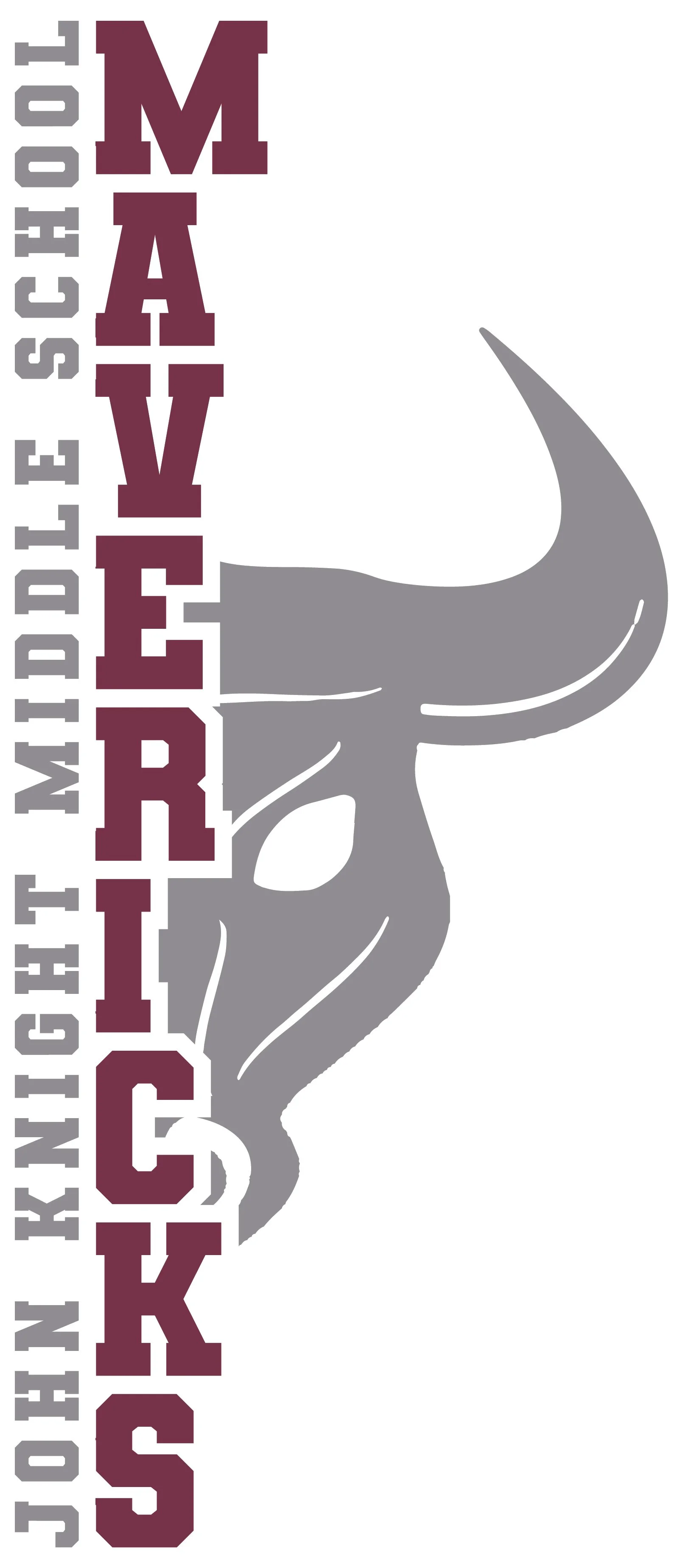
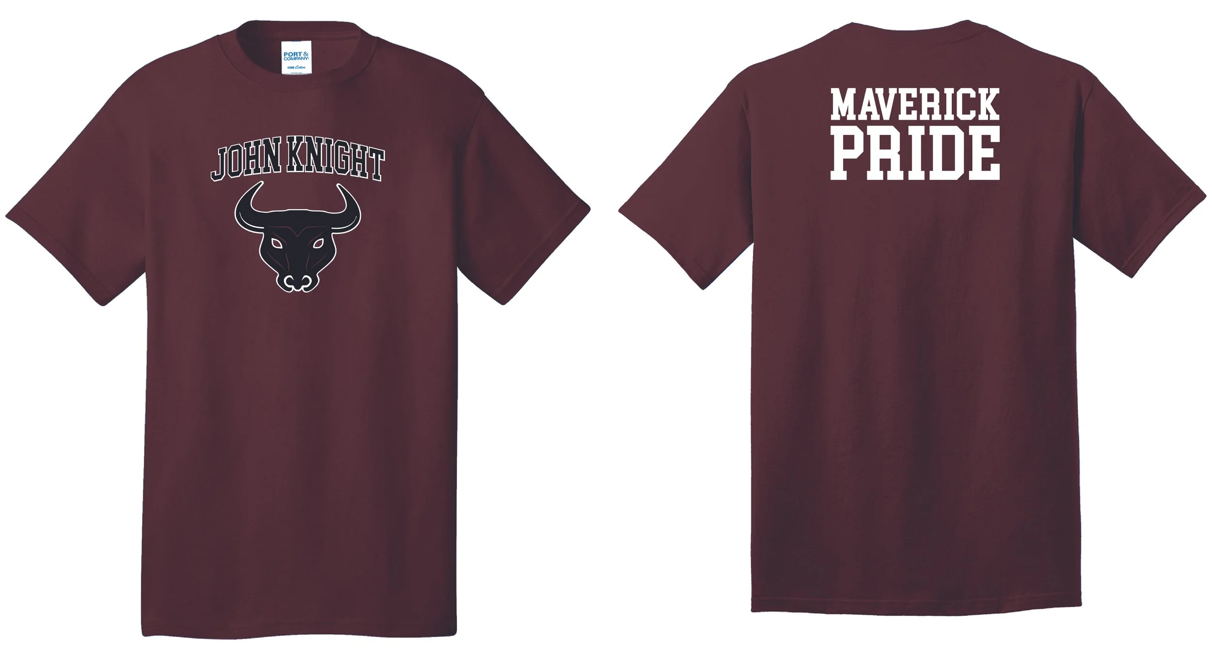
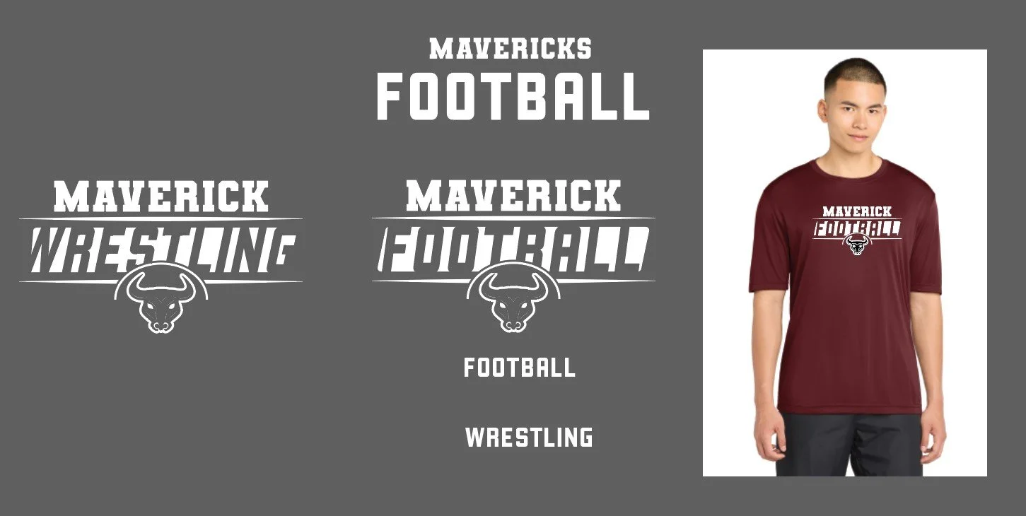
I created recurring artwork for John Knight Middle School across a variety of school and athletics needs, including jerseys, shirts, hoodies, banners, flyers, and embroidery-ready designs. Each piece was tied to a different event, team, or school use, but most of the work was unified through the repeated use of the school’s bull head logo and the “JKMS” text. The goal was to create designs that felt connected to the school’s identity while still giving each item its own purpose and character.
The Challenge
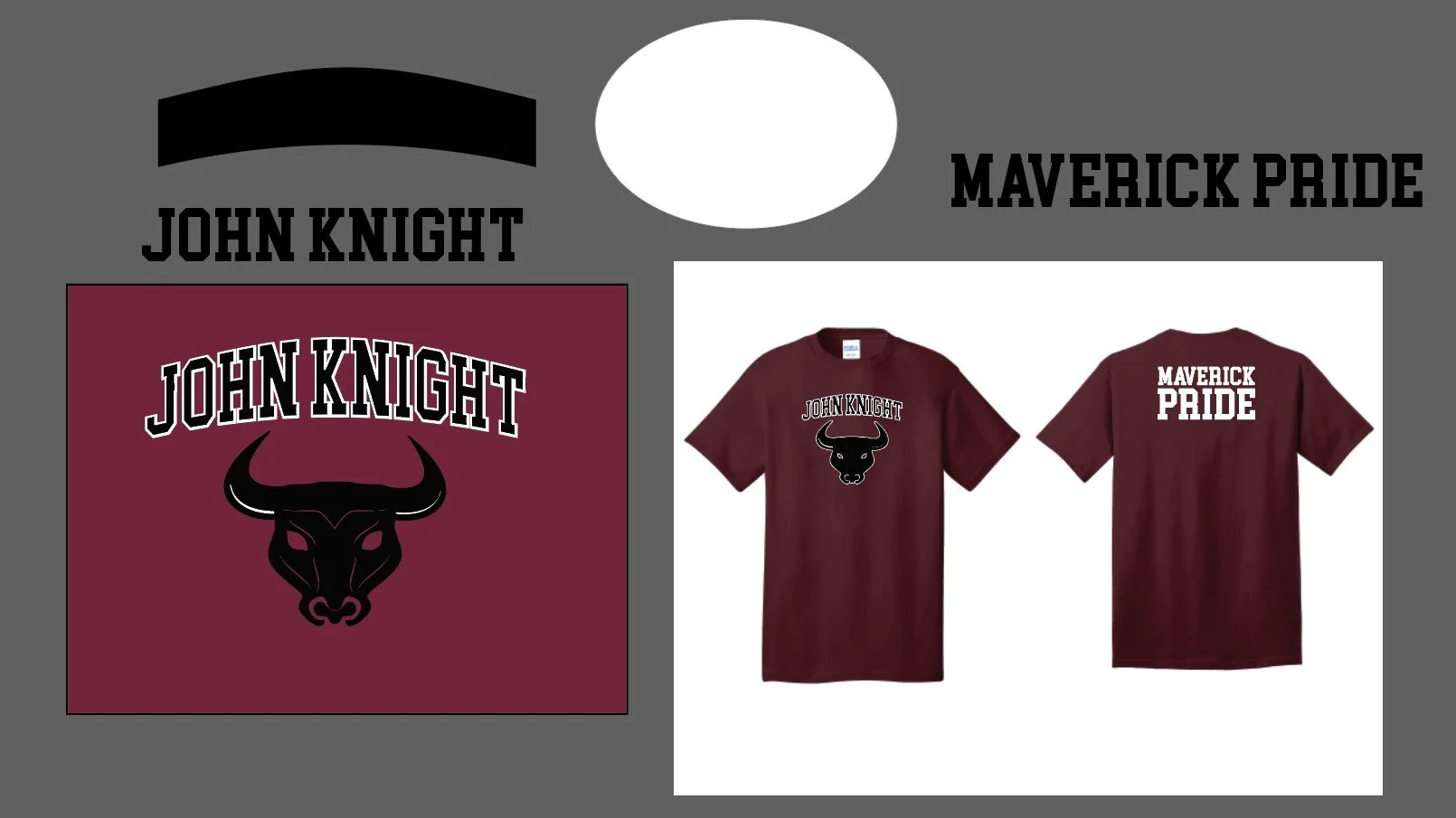
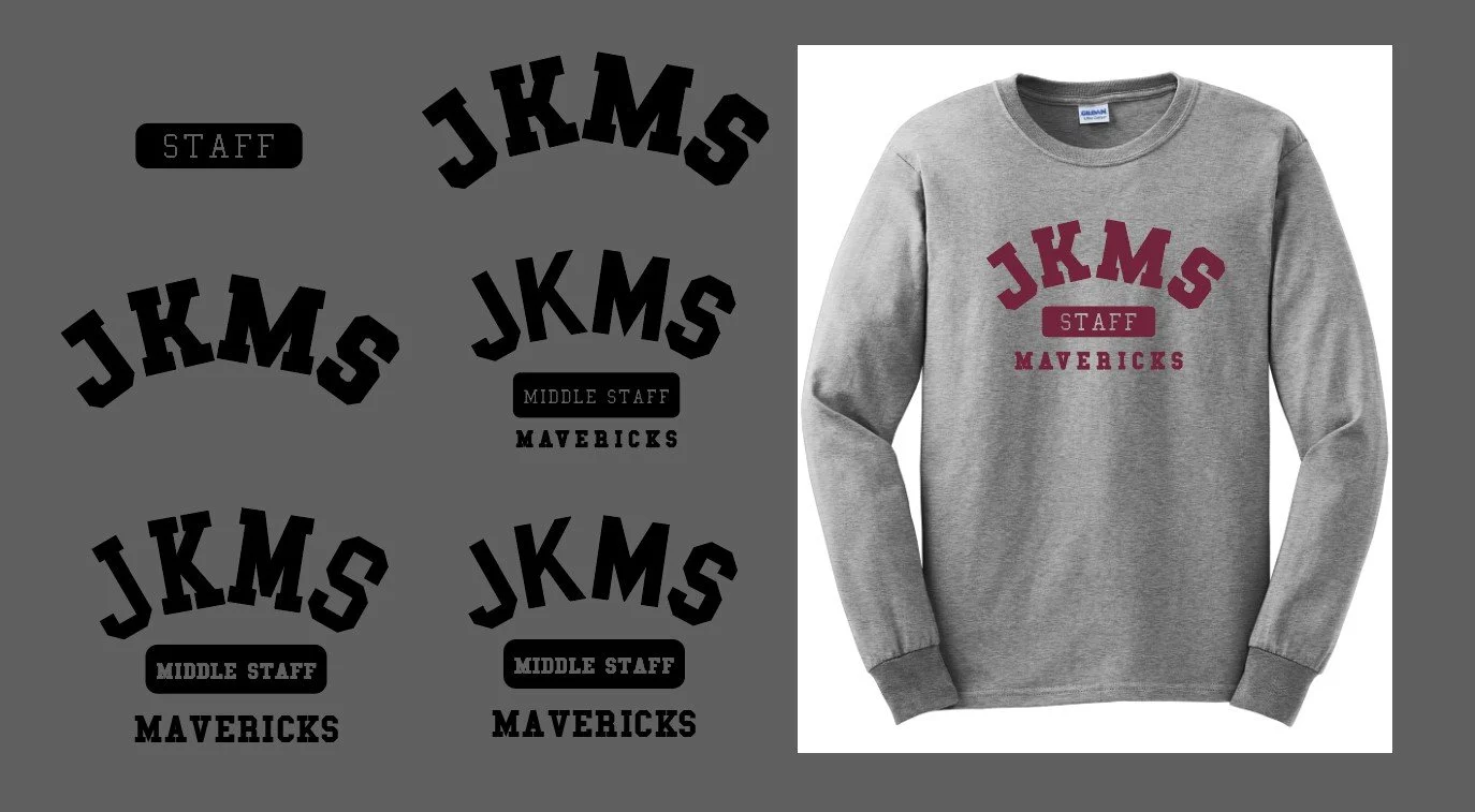
The biggest challenge was creating visually strong designs within strict production and budget limits. Because most items needed to be printed in only two or three colors, the artwork had to rely on strong typography, composition, and logo integration rather than complex effects or heavy illustration. Another recurring challenge was working in both “JKMS” and the full “John Knight Middle School” name, since smaller text can become harder to reproduce clearly once it reaches print-size limitations on apparel.
Approach
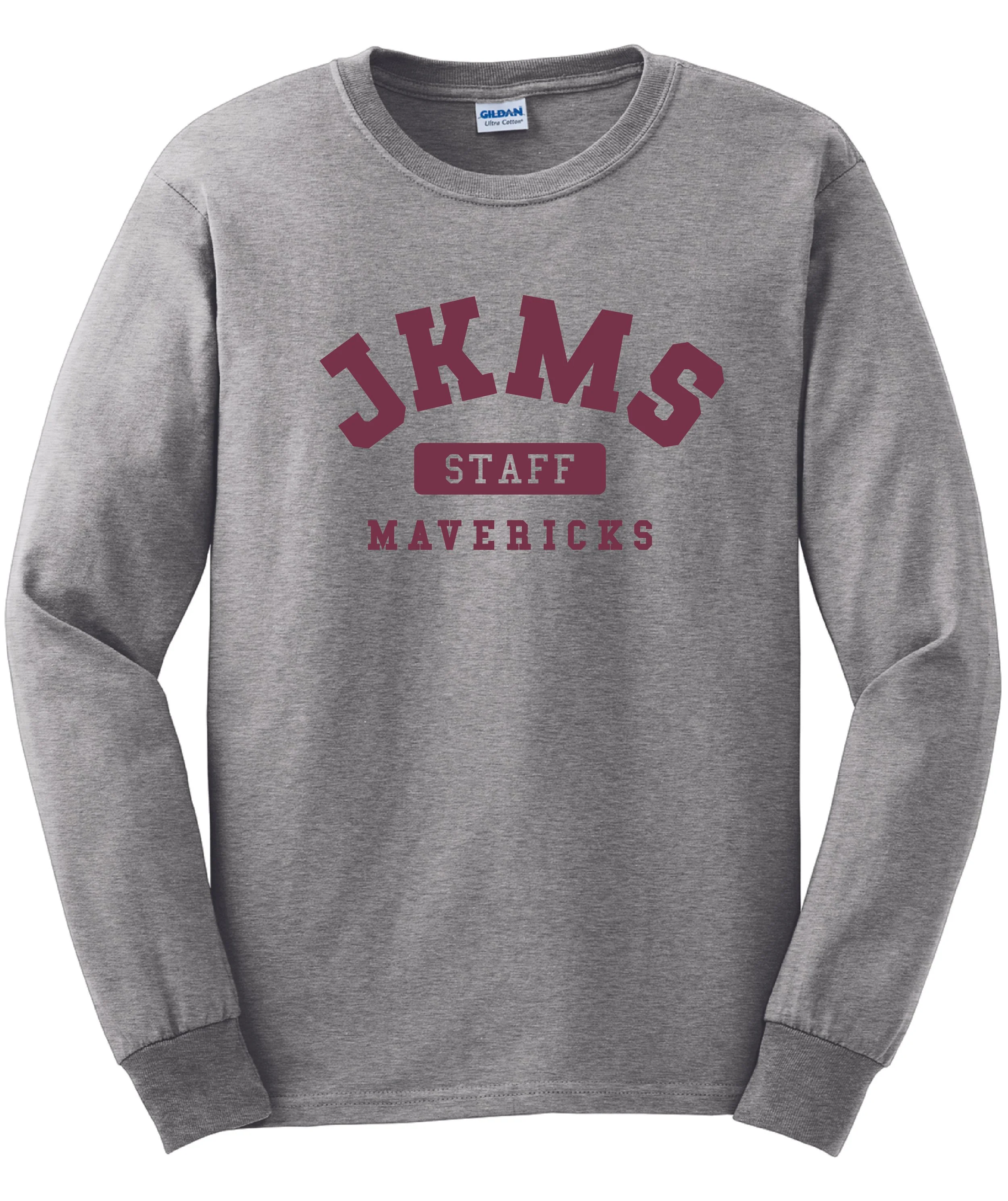
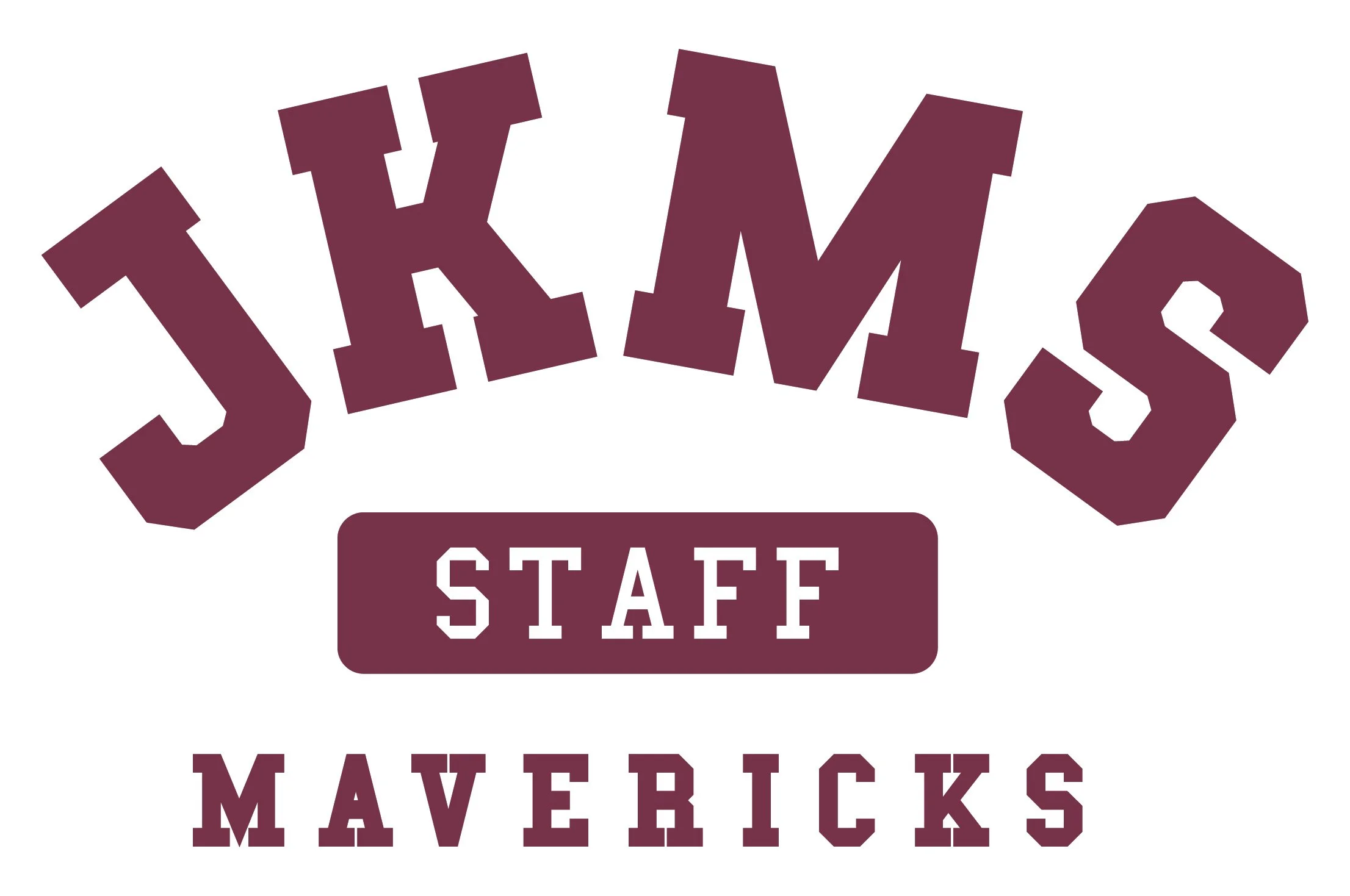
Most JKMS projects began with the same core visual elements: the bull head logo and the “JKMS” text. From there, I developed different typographic directions depending on the event, garment, or intended audience. Some pieces were created for athletics such as football, volleyball, basketball, and wrestling, while others supported school events, staff apparel, or general spirit wear.
Because the school often preferred a familiar look, part of the process involved refining simple, proven directions rather than reinventing the identity each time. At the same time, there were opportunities to explore new variations and compositions, especially when I had more creative freedom. This balance made the work less about one-off graphics and more about building a recognizable visual language that could flex across different uses.
Design Process
Production Constraints
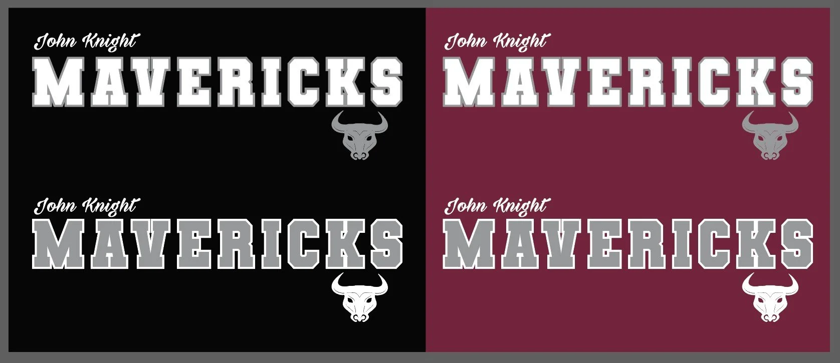
This project involved a lot of typographic exploration. Since most of the artwork had to remain simple enough for low-color printing, the success of each design came down to hierarchy, spacing, readability, and how well the bull head emblem could be worked into the composition. I often created multiple rough directions to test different treatments of “JKMS,” different ways to incorporate the mascot, and different approaches for including the full school name without losing clarity.
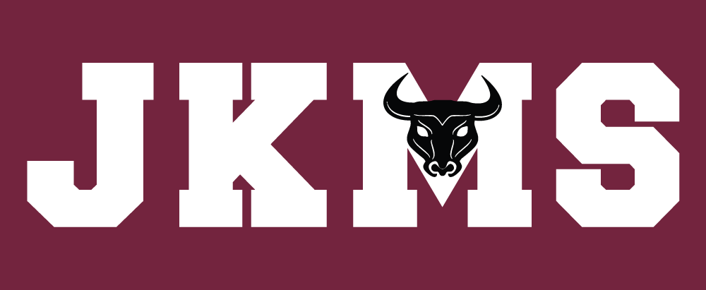
Over time, one of the strongest recurring directions became the “JKMS” treatment with the bull head placed directly in the middle. That layout proved flexible enough to repeat across pinnies, jerseys, and other apparel while still leaving room for smaller variations depending on the item or event.
The print limitations were not something solved after the design was finished — they were part of the design process from the beginning. With only two or three colors available for most pieces, every design decision had to be made with simplicity, readability, and print efficiency in mind. That meant making sure the type stayed legible, the layout stayed clean, and the artwork could hold up across different garments and production methods without becoming visually weak.
Outcome
The result was a body of work that stayed visually connected to John Knight Middle School while remaining practical for a wide range of school uses. Some designs were one-off solutions for specific events, while others became repeatable formats that the school returned to over time. This project reflects my ability to create within an established identity, develop multiple design variations, and make strong visual decisions under real production and budget constraints.
It also shows a different side of my process: using typography, restraint, and consistency to create work that feels intentional and useful without relying on complexity.