Sacramento United Academy & Spirit Wear
Campaign case study
A multi-year apparel and promotional graphics system developed for Sacramento United across academy, spirit wear, and online store programs—balancing seasonal freshness, long-term consistency, cost efficiency, and production-ready execution.
Overview
Over roughly six years, the work expanded beyond academy apparel into spirit wear, online store graphics, and select event assets. The challenge was not just making strong individual pieces, but building artwork that could stay recognizable to the club, hold up across repeated use, and remain flexible under changing budgets.
Design Evolution
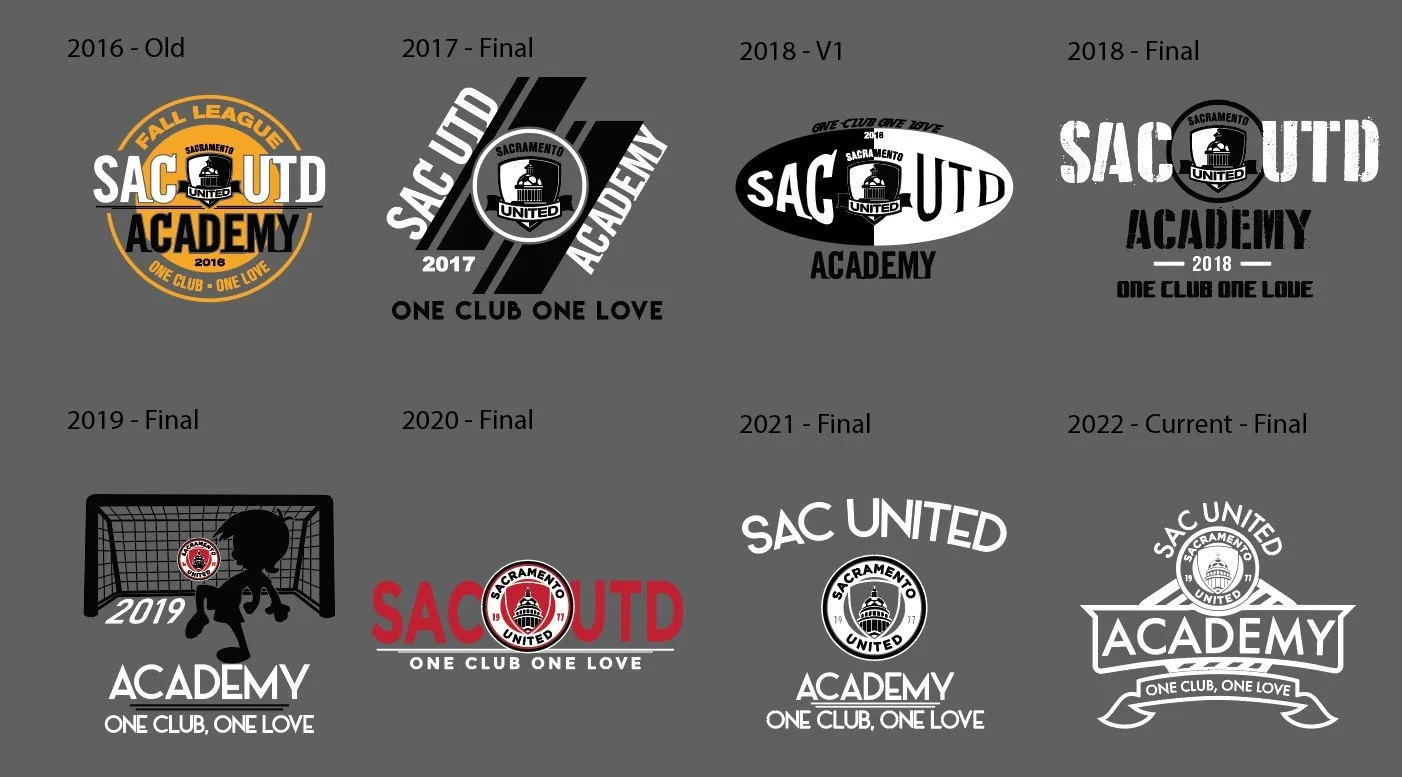
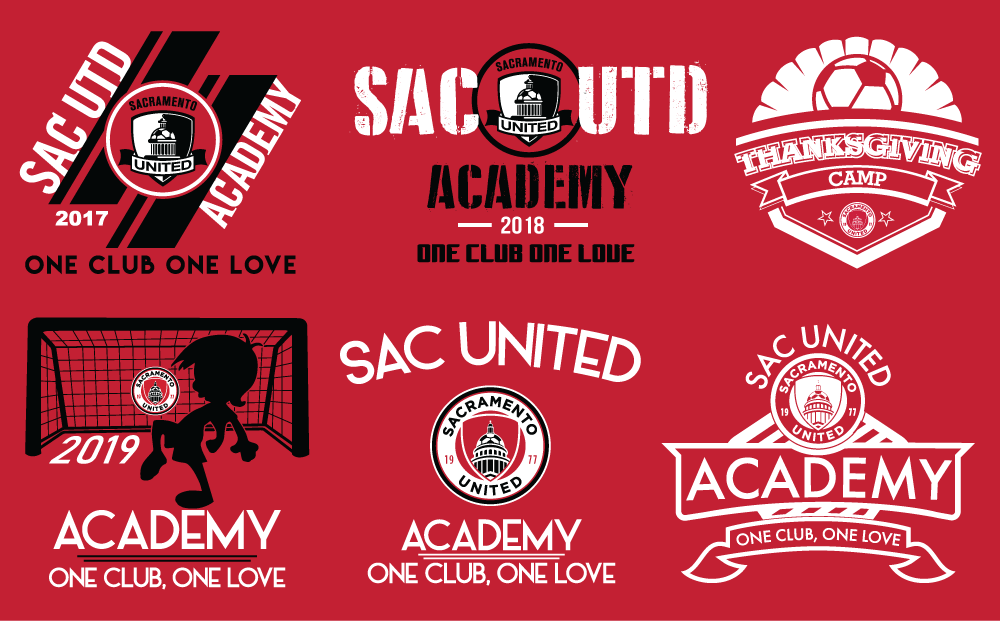
The work evolved from more season-specific graphics into a cleaner and more reusable design direction. Earlier pieces explored a wider range of layouts and concepts, which helped establish different campaign looks over time. Later work became more streamlined and modular, allowing successful designs to be reused with small updates such as a new title, seasonal tag, or event designation.
This shift was important because it reflected both the client’s changing needs and a stronger long-term design strategy. Rather than redesigning from scratch each time, the system became more sustainable—preserving club recognition, reducing artwork costs, and supporting consistent use across future apparel runs.
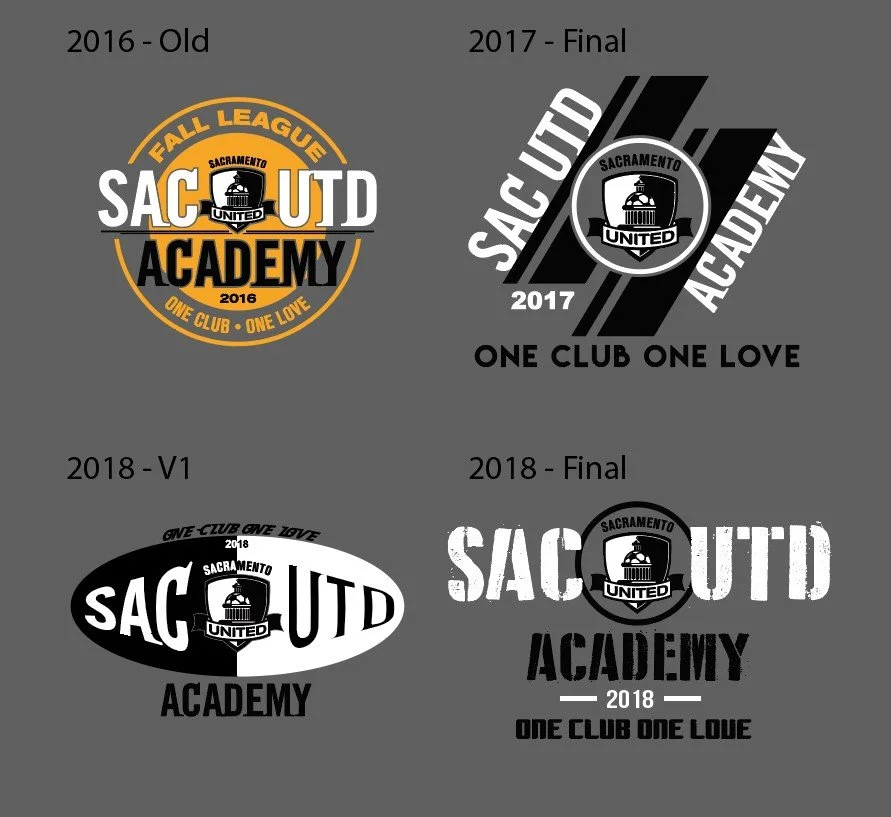
Early campaign exploration
More seasonal variety, broader concept swings, and one-off yearly treatments that helped establish range.
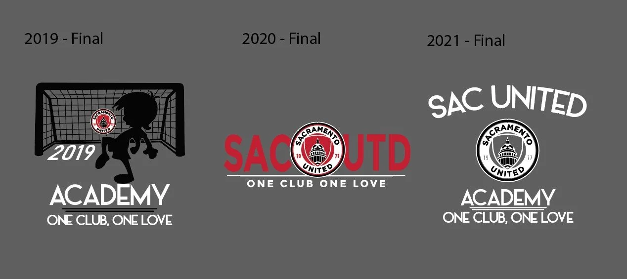
System refinement
Stronger hierarchy, cleaner typography, and repeatable structures that reduced cost without losing energy.
SPOTLIGHT
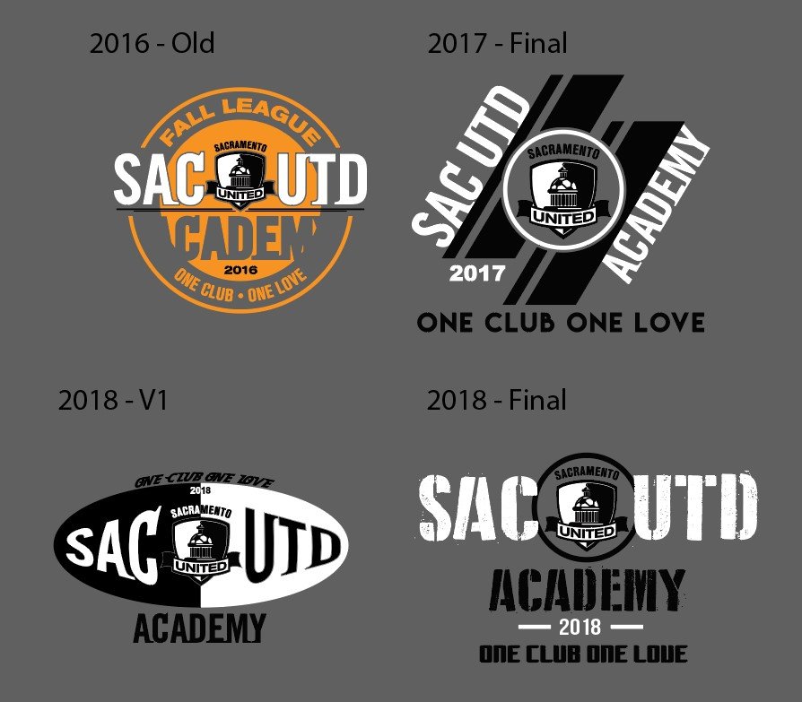
OMG Store Collegiate direction
This section should isolate the collegiate design that went through multiple rounds before settling into the current version. Treat it as proof of refinement: concept exploration, iteration, and successful long-term reuse.

-
6 Years
-
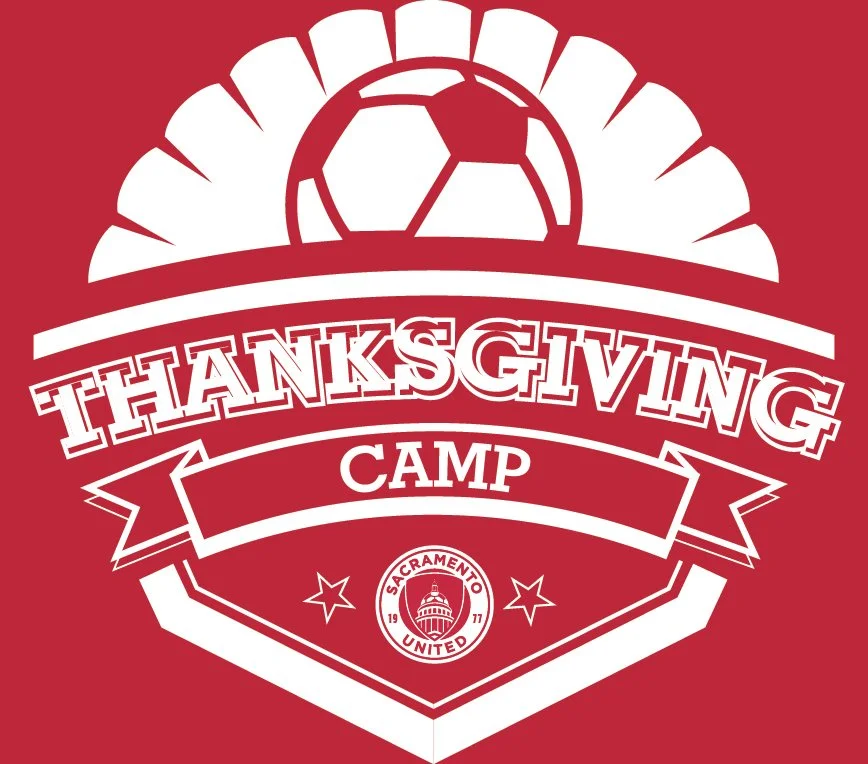
Academy gear, spirit wear, online store items, event banners
-
2–3 color max, budget shifts, reusable art direction
-
Concept development, visual direction, refinement, production-aware execution
Approach
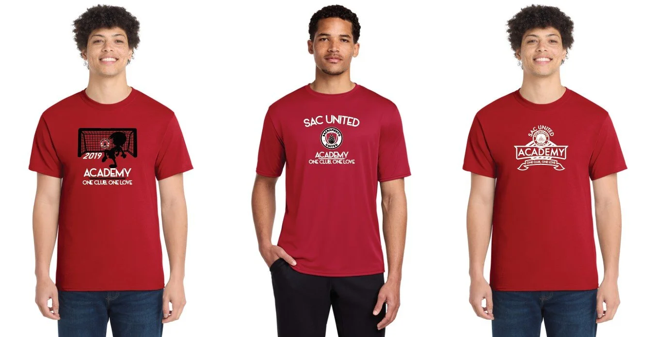
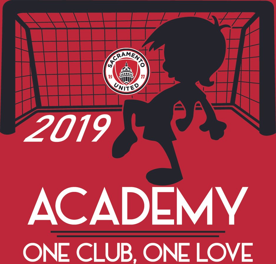
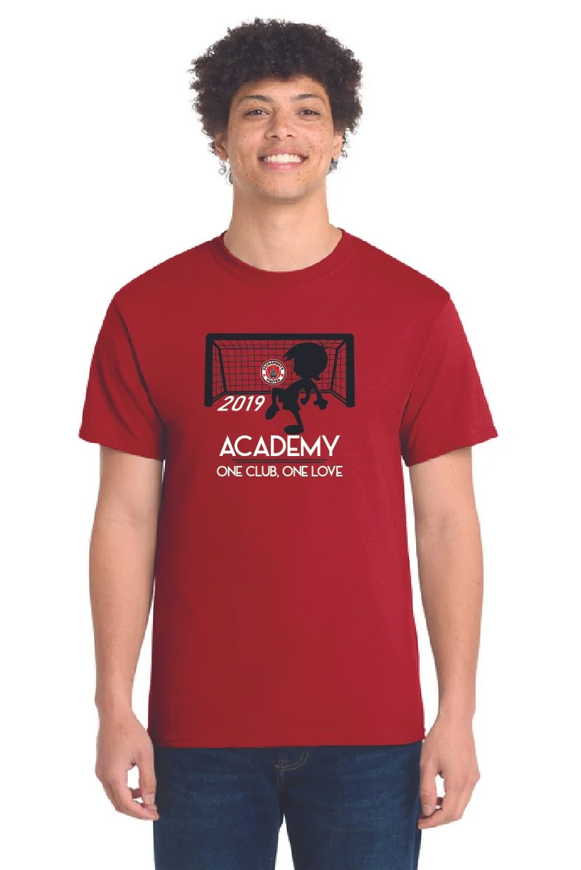
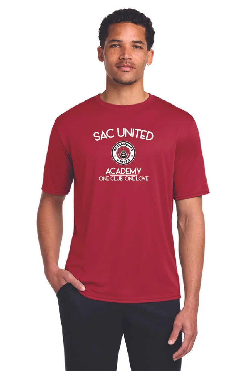
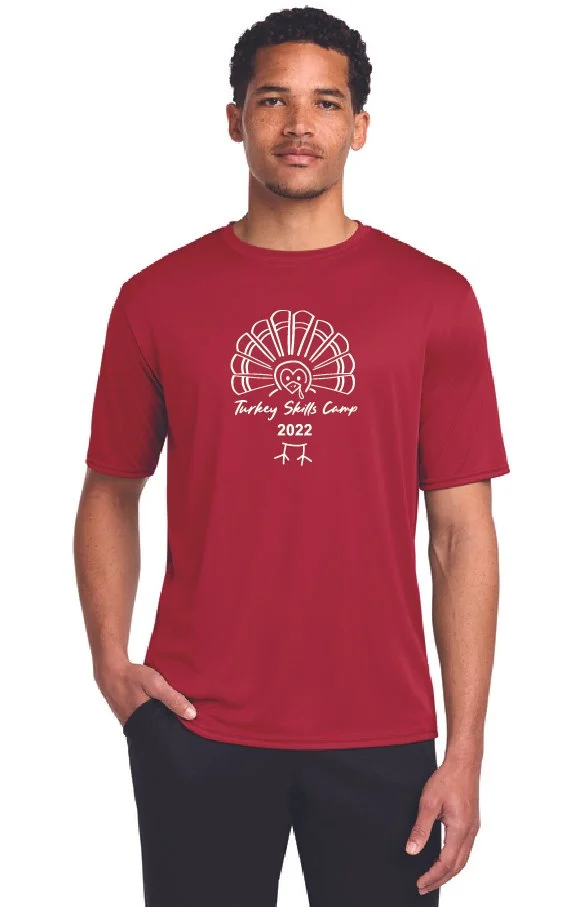
Most requests started with a general theme, but the visual direction was largely developed through focused concept variations. Designs were built around 2–3 color production limits, often using garment color as part of the final composition to reduce setup costs while maintaining energy, readability, and club recognition.

Long-term reusable direction
A more durable look that could be refreshed with small updates like titles, tags, or event-specific wording.
Outcome
Why the system worked
The final direction became a more sustainable design solution for repeat club use. Instead of reinventing the work every season, the system allowed successful artwork to be refreshed with smaller updates while keeping costs, consistency, and production efficiency in balance.