M1 Roofing
The client initially reached out to have branded garments produced for their new roofing business. During our discussion, I asked how they felt about their existing logo and learned that while it was serviceable, it didn’t strongly represent their brand or stand out in the market.
Before production began, I proposed exploring a logo redesign to strengthen their visual identity, with the option to retain the original if they preferred. The client agreed, allowing me to develop alternative concepts.
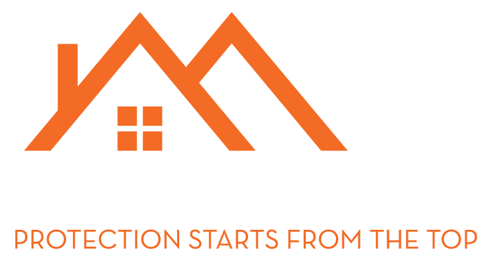
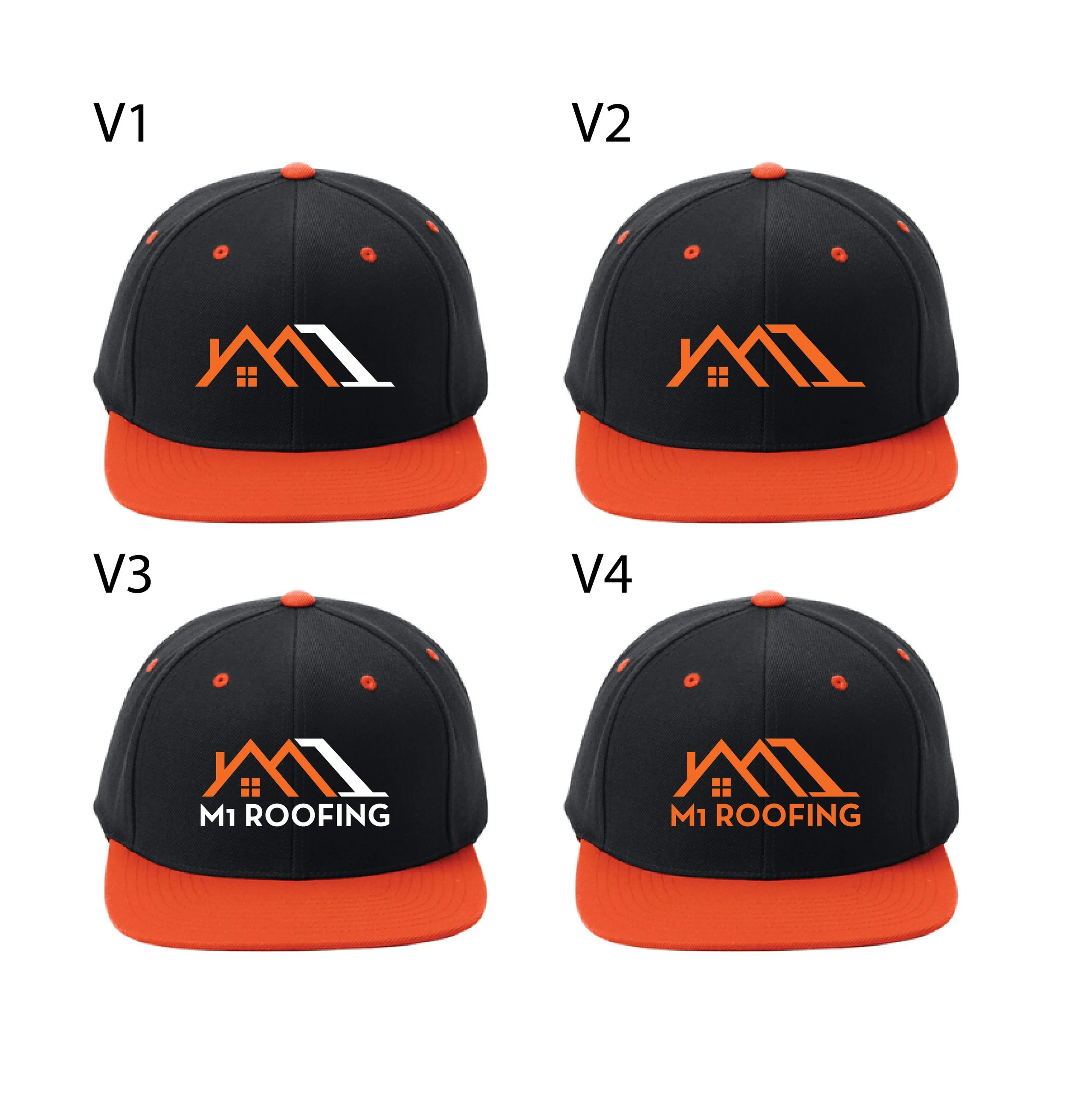
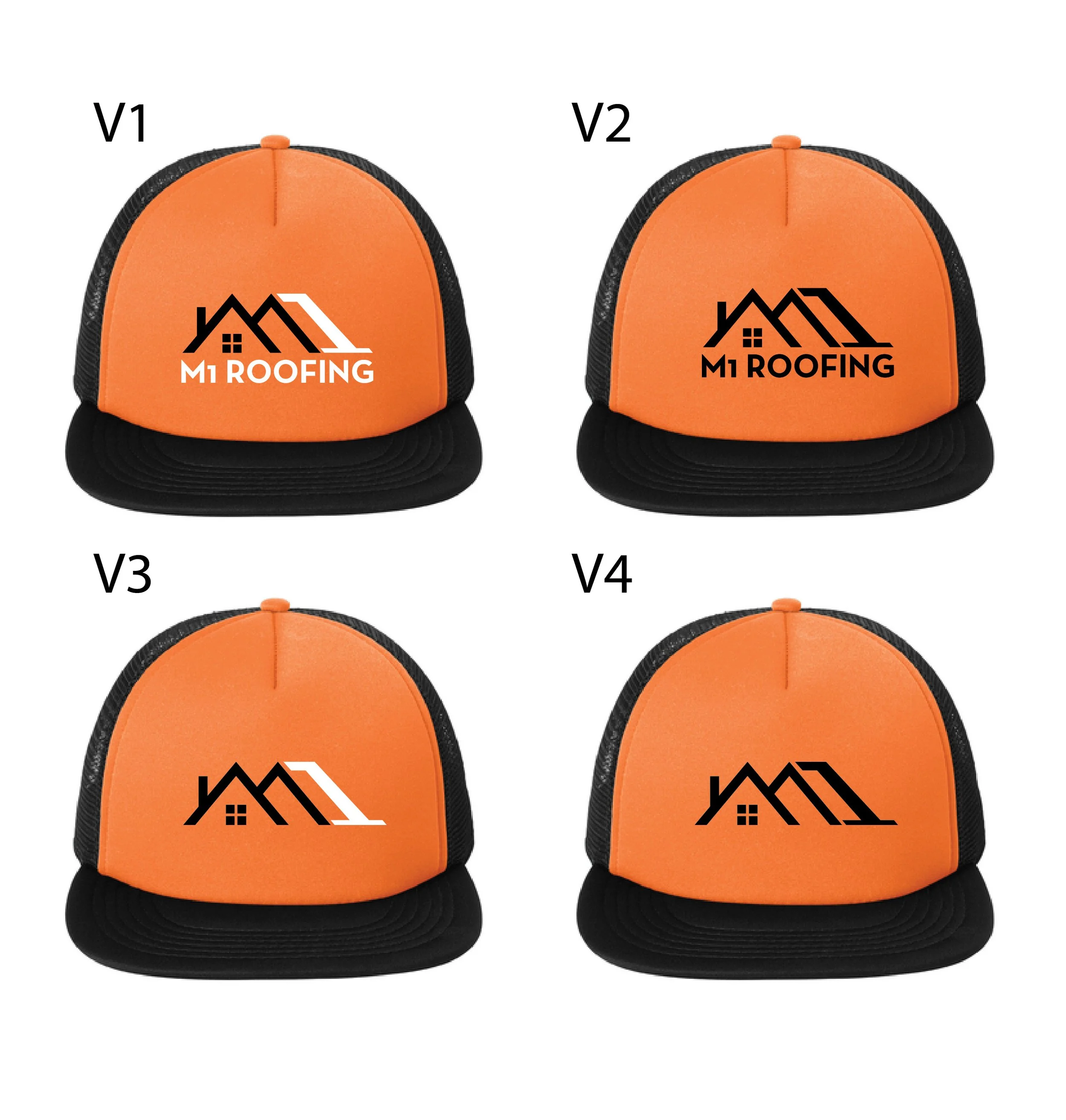
Upon reviewing the existing logo, I identified that it relied heavily on common roofing imagery and lacked distinctiveness. My goal was to maintain recognizable industry cues while creating a more unique and memorable identity. For M1 Roofing, I developed a logo concept that transformed rooflines into the letter “M,” creating a direct visual connection between the company name and its services.
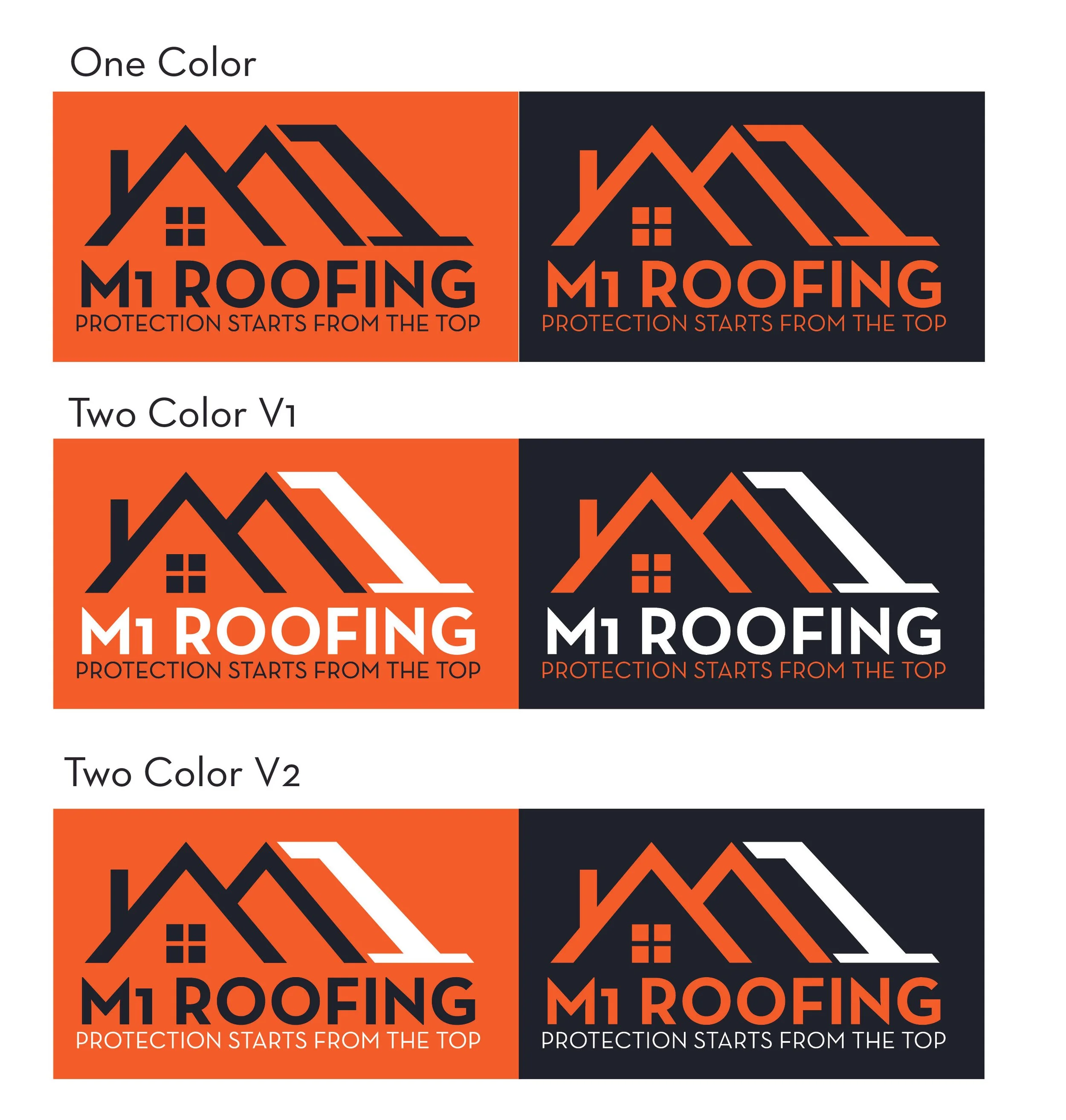
I selected Neutraface for its architectural roots and clean, structural feel, which reinforced the company’s trade and professionalism. After presenting several variations, the client selected a final direction.
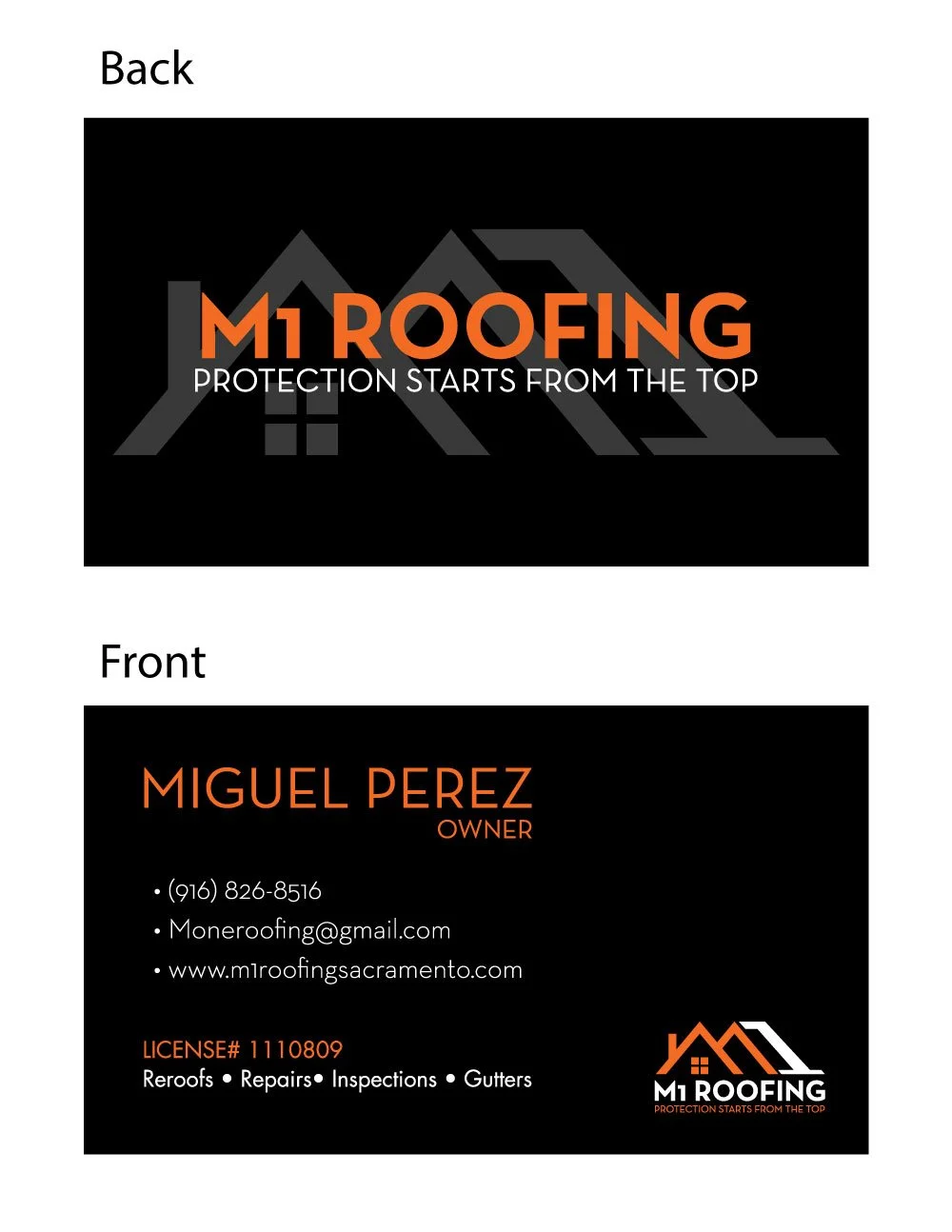
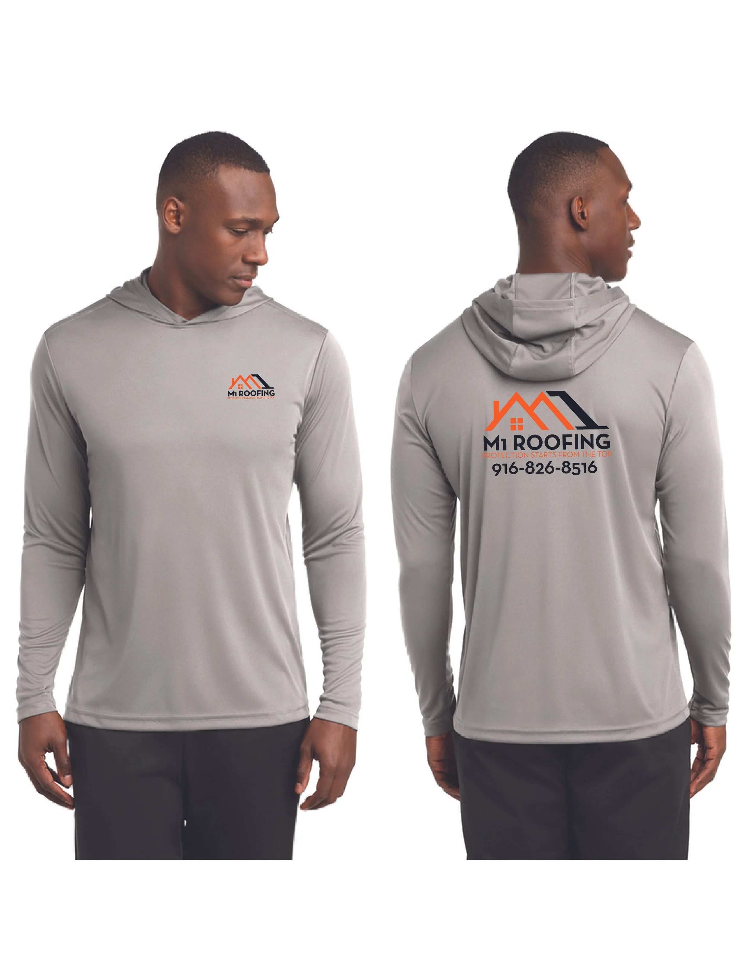
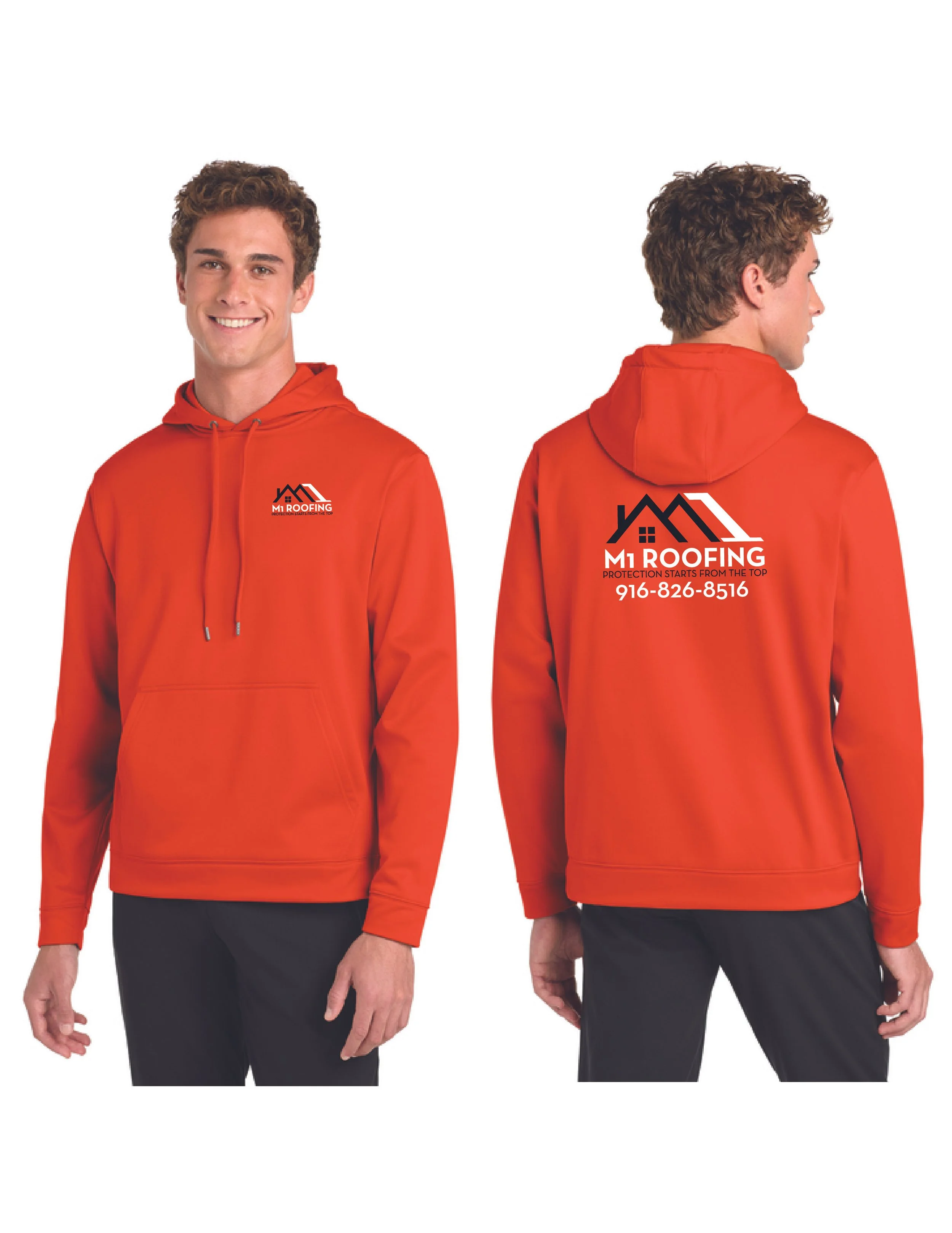
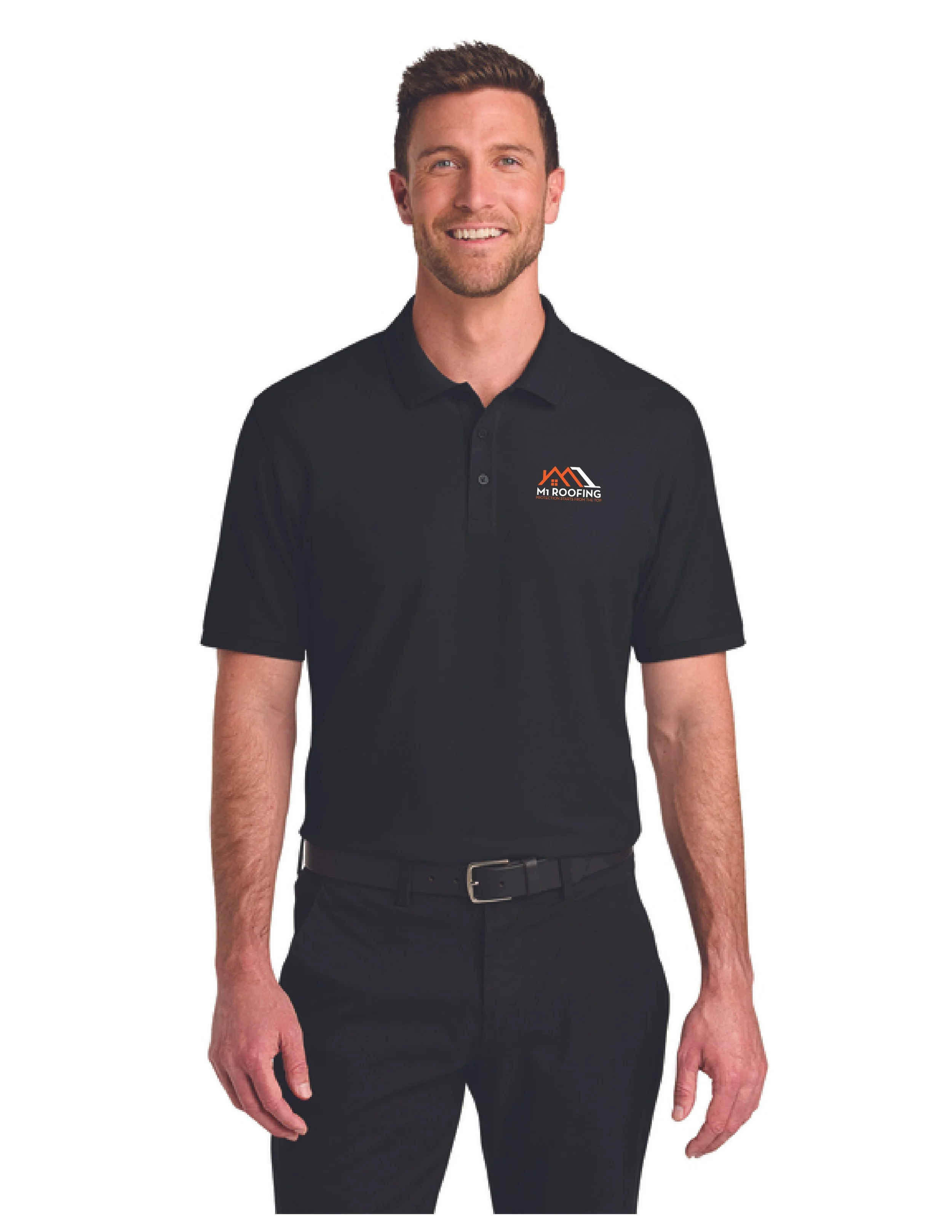
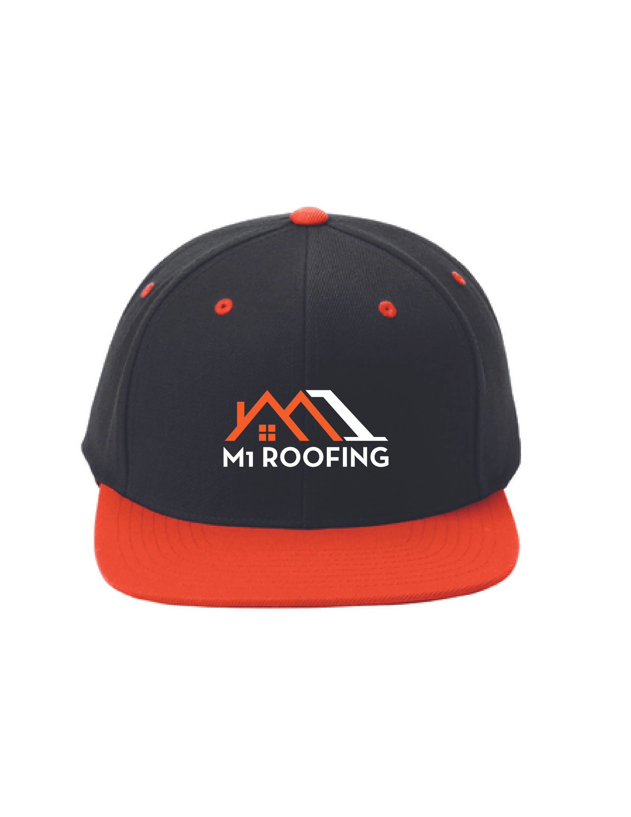
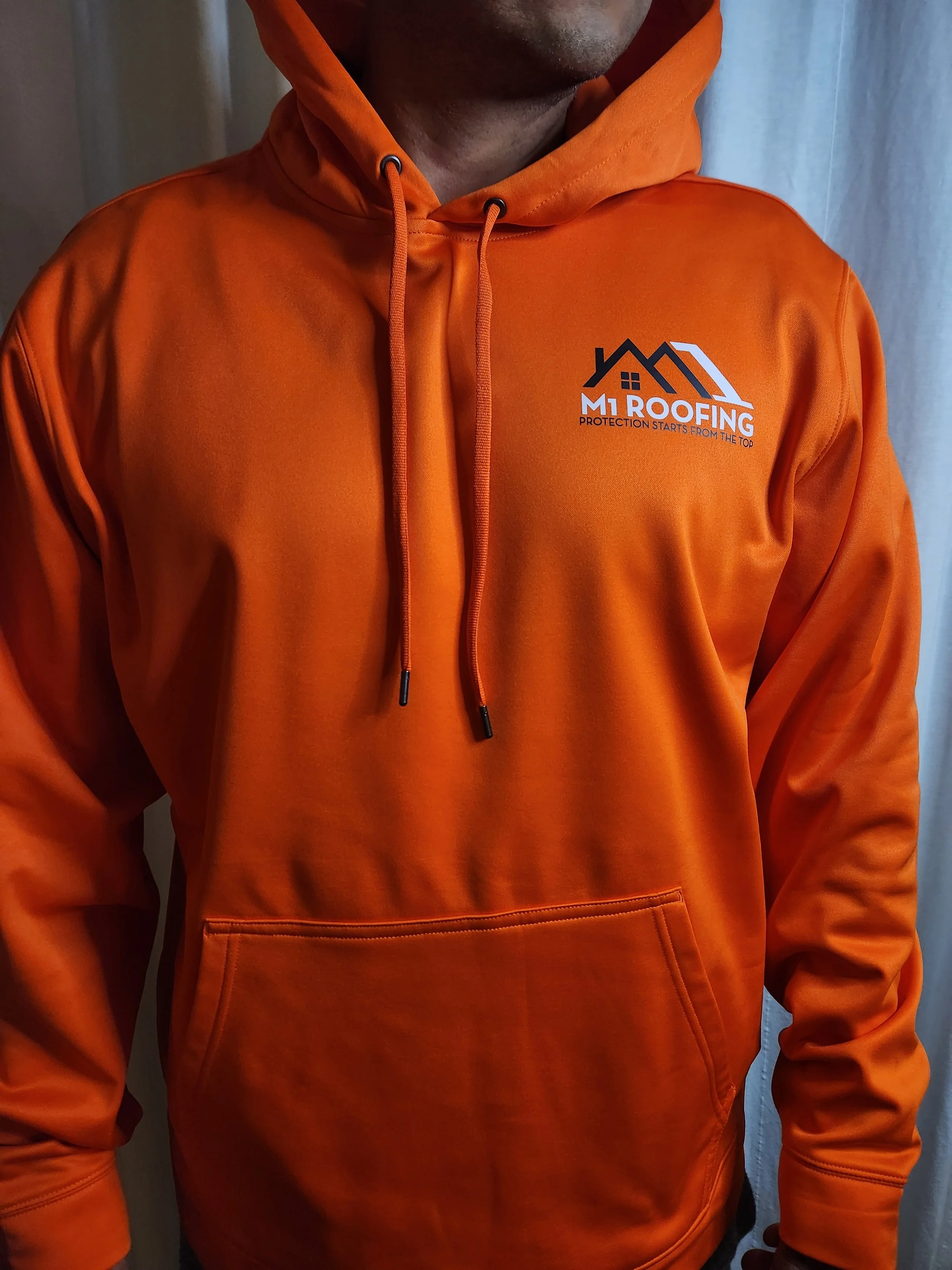
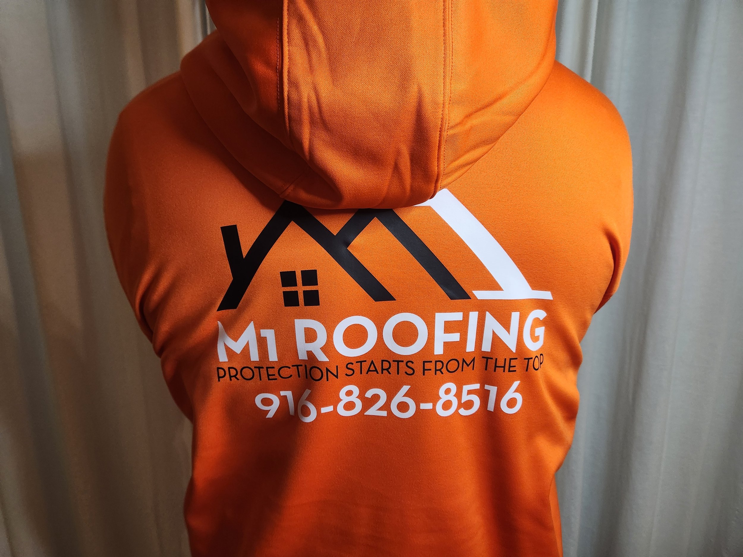
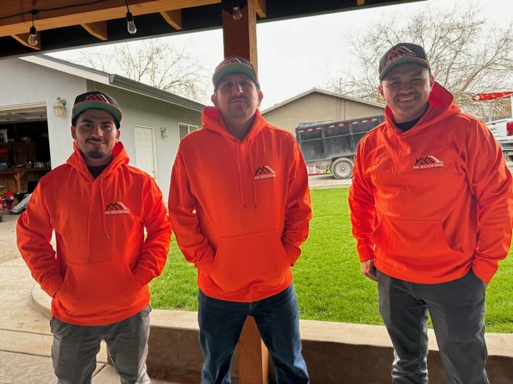
The new branding was applied across marketing materials and custom garments. The client was extremely satisfied with the result and went on to place multiple additional orders, establishing a cohesive brand identity for their growing business.